Year
2025
Crafting a Revolutionary E-Commerce Presence for Architectural Menswear
Axiom approached me to create a distinctive e-commerce experience that would set them apart in the crowded streetwear market. They needed a platform that would showcase their architectural-inspired menswear while providing a seamless shopping experience that reflected their brand philosophy of "structured minimalism."
Scope of Work


Overview
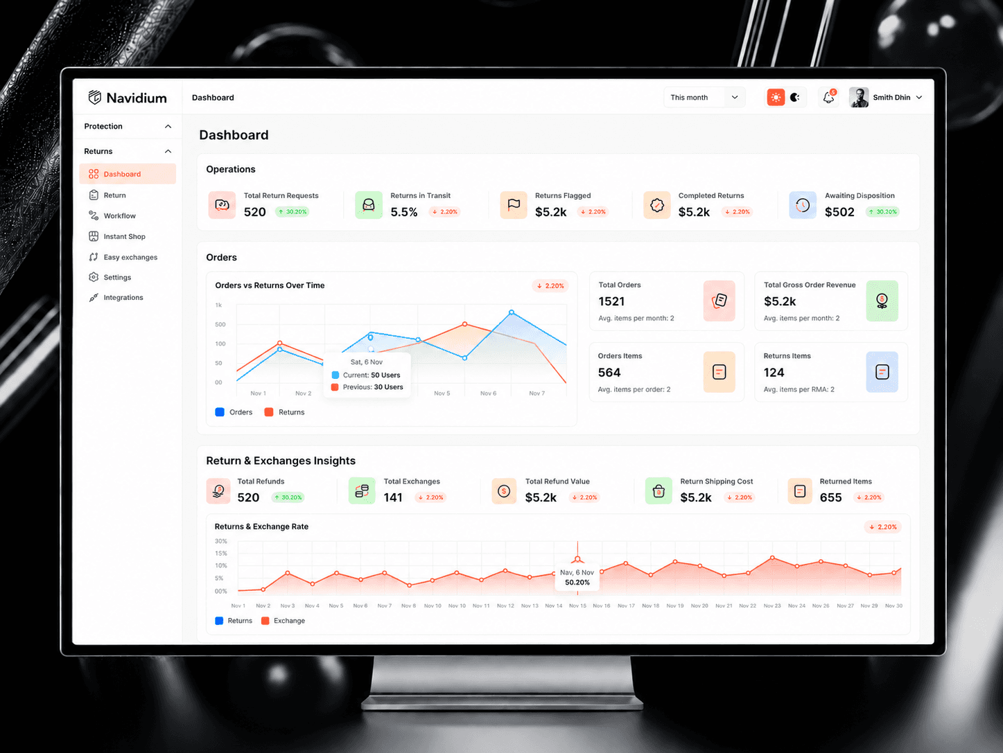
Shopify merchants often hit a revenue ceiling — not because of traffic, but because of what happens (or doesn't happen) between product discovery and checkout. Dynamatic is a Cart & Upsell Engine built to close that gap. It gives merchants 50+ customizable widgets, intelligent upsell logic, and deep personalization tools to increase both conversion rate and average order value — without needing a developer.
I designed the product end-to-end: from the merchant onboarding experience to the widget builder, analytics dashboard, and every upsell flow in between.

Which allows your project pages to be highly adaptable.
Unlike traditional templates with rigid image slots, this system gives you complete freedom to present unlimited project images without modifying the template structure. Your portfolio adapts to your content rather than forcing your work to fit predetermined formats, ensuring your projects look professional across all devices.


Add optional descriptions to explain your work.
Enhance your project showcases with tailored descriptions that provide context and highlight key aspects of your process. These optional text blocks let you emphasize specific features, explain challenges you overcame, or detail the results achieved for the client.

You can select ratios for your images.
Choose from various aspect ratios to present your work in the most flattering format. This flexible system allows you to optimize each image display based on content type - whether you need widescreen presentations for landscapes or square formats for logos.

For example this image is using a 16:9 ratio.
Widescreen formats are perfect for showcasing device mockups, web designs, and panoramic visuals. The 16:9 ratio provides a cinematic feel that works exceptionally well for digital interfaces and presentation-style content.
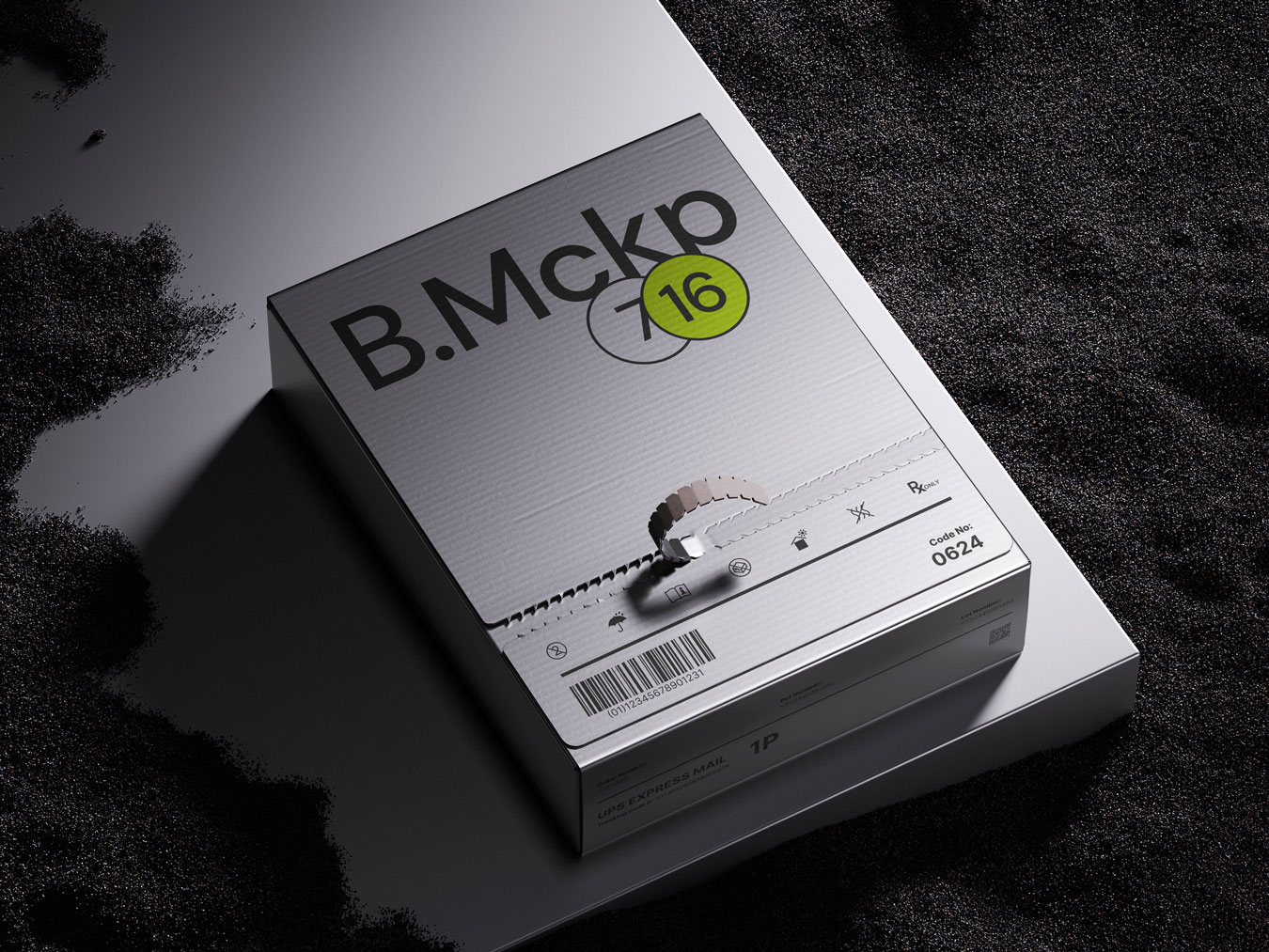
And this one is using a 4:3 ratio.
The classic 4:3 ratio offers a balanced frame for product photography, print work, and traditional layouts. This proportion provides more vertical space, making it ideal for packaging designs, book covers, and print materials.


You can even add a second image.
Create powerful visual comparisons by placing images side by side. This feature is perfect for before/after demonstrations, showing variations of a design, or presenting multiple views of physical products. Paired images tell a more complete story of your creative process.

Dynamatic